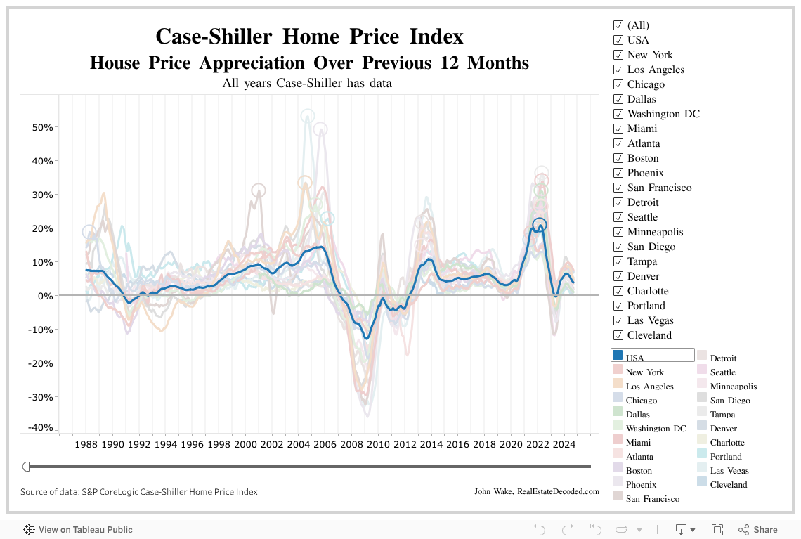
Historic appreciation since 1980s. Leading up to ‘08, YoY appreciation was averaging 7-10% across the US.
Additional Graphs
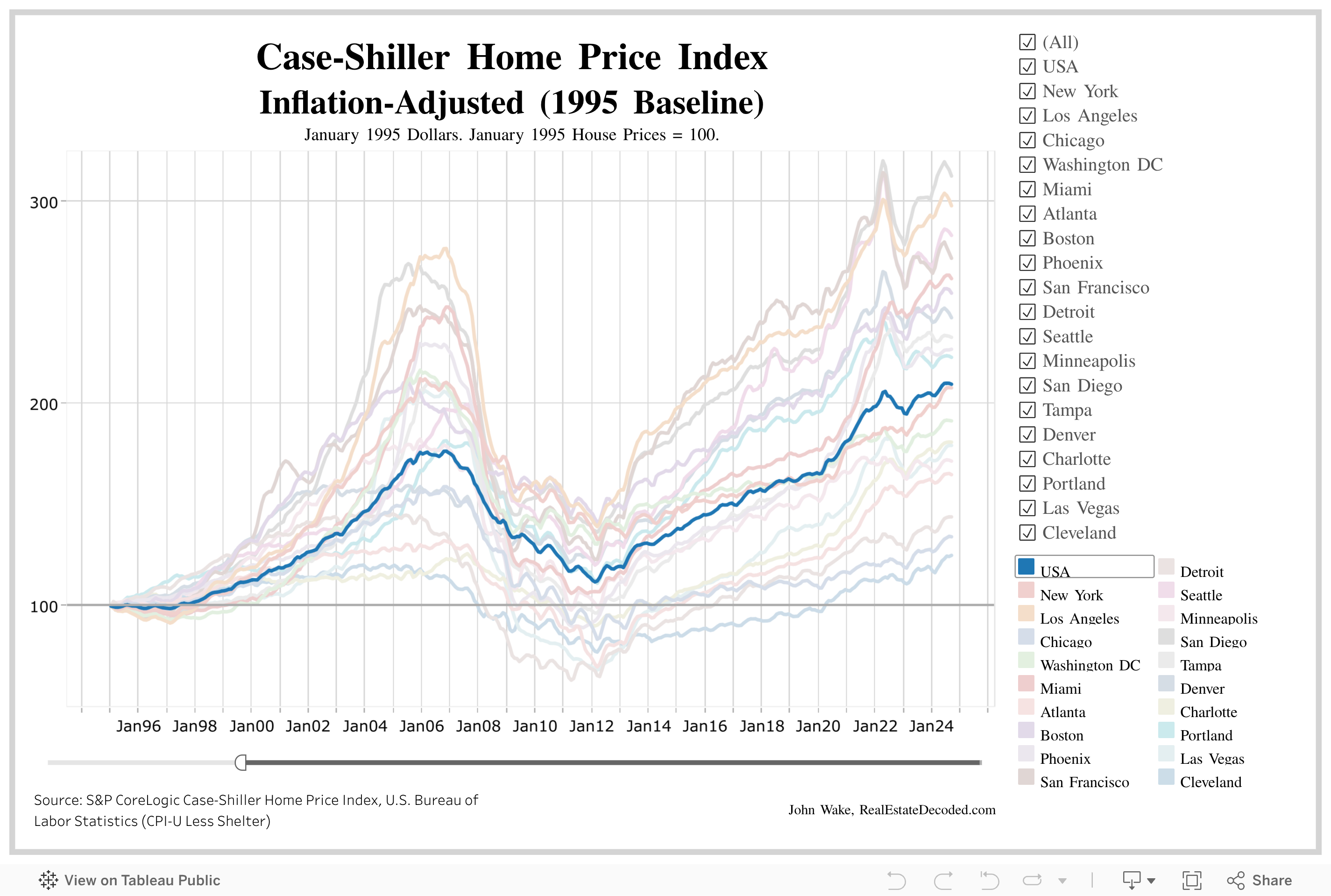
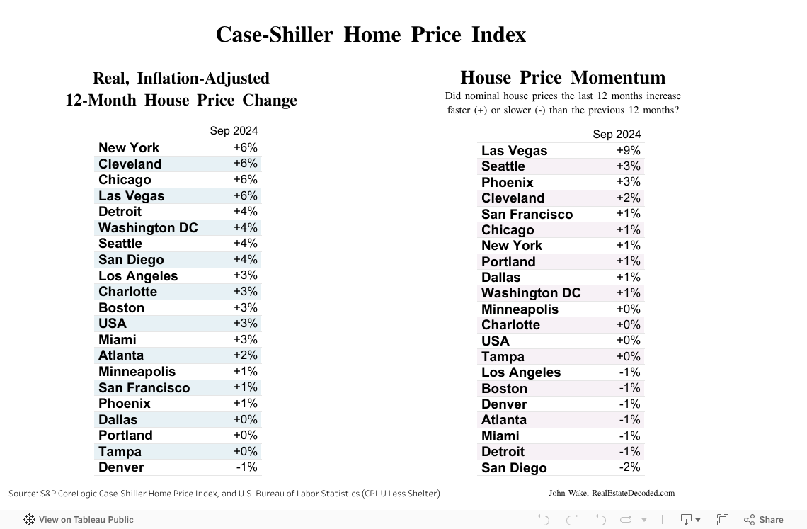
Case-Shiller Home Price Index
The Case-Shiller Home Price Index measures house price inflation by looking at repeated sales of the same single-family houses. The baseline value of 100 indicates that the price of a house has not disproportionally changed compared to the price of other commodities. A value of 200 indicates house prices have doubled (and so on…)
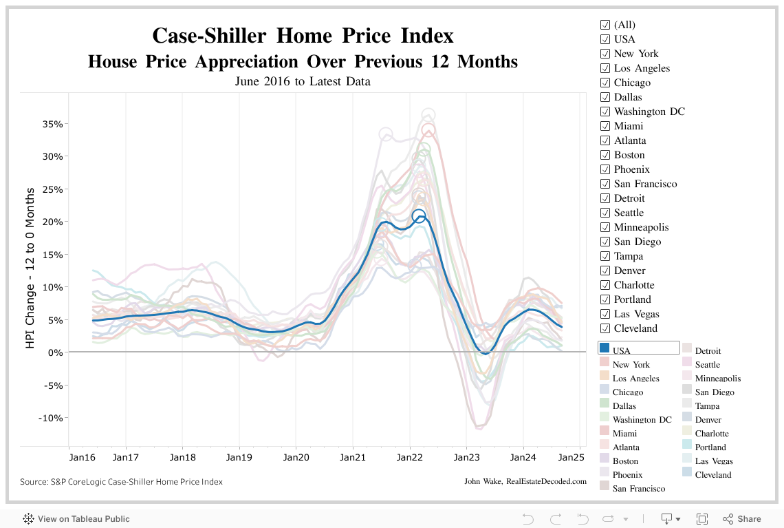
One caveat is that the Case-Shiller data is slow. It runs almost 2 months behind and the data is a 3-month moving average.
Also take into account the 3-month running average. Data for June would be data for all of April, May, and June.
Green: Mortgage Debt
Red: Consumer Debt (Credit Card, Auto, Personal Loans, etc)
Blue: Sum of Green & Red (Mortgage + Consumer)
Purple: Other commitments (rent, leases, insurance, taxes, etc)
10 Year Treasury Note Spreads
Blue: Corporate Bond vs T-Note
Red: 30Y Fixed vs T-Note
Higher % Spread indicates higher risk
Expectation of constant spread
Reducing excessive spread:
Improve macroeconomic picture by reducing perception of risk
Govt. guarantees debt
Govt. buys risky securities, driving prices up and yields down
1995 baseline allows us to see the beginning of the Great Real Estate Bubble.
Starting mid-2020, U.S average YoY appreciation has been between 10-20%.